HOME
APPLIANCES
E-COMMERCE
SITE
REDESIGN
Tehnohata is a home appliance retailer with over 20 years of experience, known for its personalised service and expertise. As the product catalogue grew, the website struggled to support efficient product discovery and communicate the trust and guidance customers expect when making high-consideration purchases.
This project focused on redesigning the shopping experience to improve navigation, strengthen brand perception, and help users make purchase decisions with greater confidence.
BEFORE
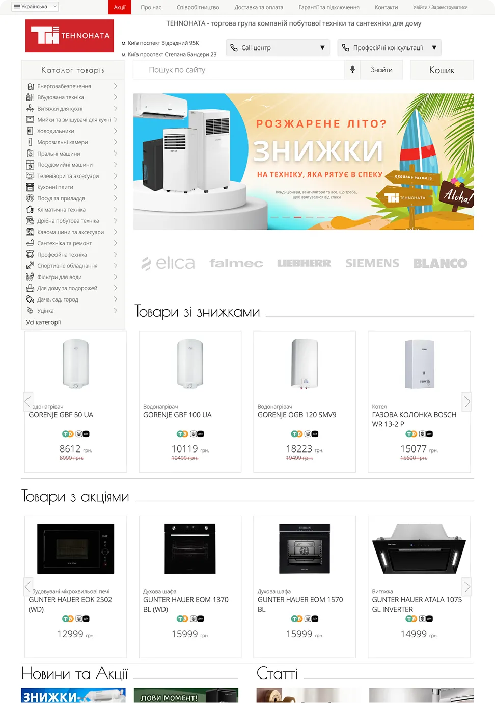

Sensitive content
This photo contains sensitive content, such as poor layout and typography, which some people might find offensive or disturbing.
AFTER


Sensitive content
This photo contains sensitive content, such as poor layout and typography, which some people might find offensive or disturbing.
Problem
The existing shopping experience creates friction throughout the customer journey, making it harder for users to discover, evaluate, and purchase products with confidence.
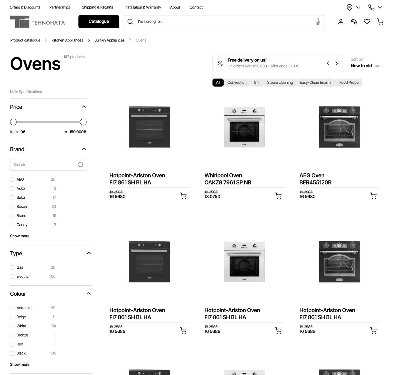
Product discovery feels slow and cumbersome.
Product information is difficult to scan and compare.
The site's visual design undermines trust and brand credibility.
Navigation and filtering create unnecessary friction.
Goals
Create a more intuitive, confidence-inspiring shopping experience by improving product discovery, usability, and brand perception.
Improve product discovery through clearer navigation and filtering.
Support faster product evaluation with better information hierarchy.
Increase trust by surfacing key differentiators earlier in the journey.
Create a modern, polished experience that reflects the brand's expertise and personalised approach.
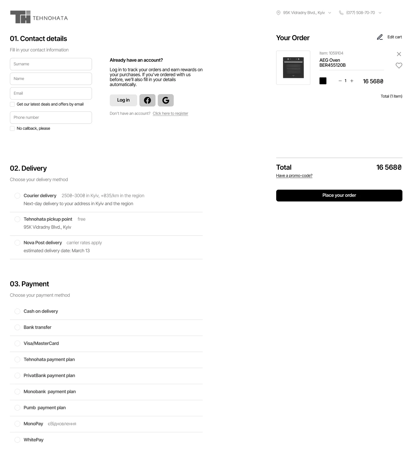
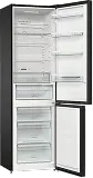
I then mapped out the key journey of purchasing an oven to structure the experience around a realistic, goal-driven scenario. This flow is a simplified version of the original for illustrative purposes.

Anna is a working mother from Kyiv who values practicality and reliability when choosing home appliances. She wants technology to simplify her life, but is cautious about where she buys it from.
I want reliable, long-lasting appliances from reputable brands.
I'm interested in promotions and discounts, as renovation gets pretty expensive.
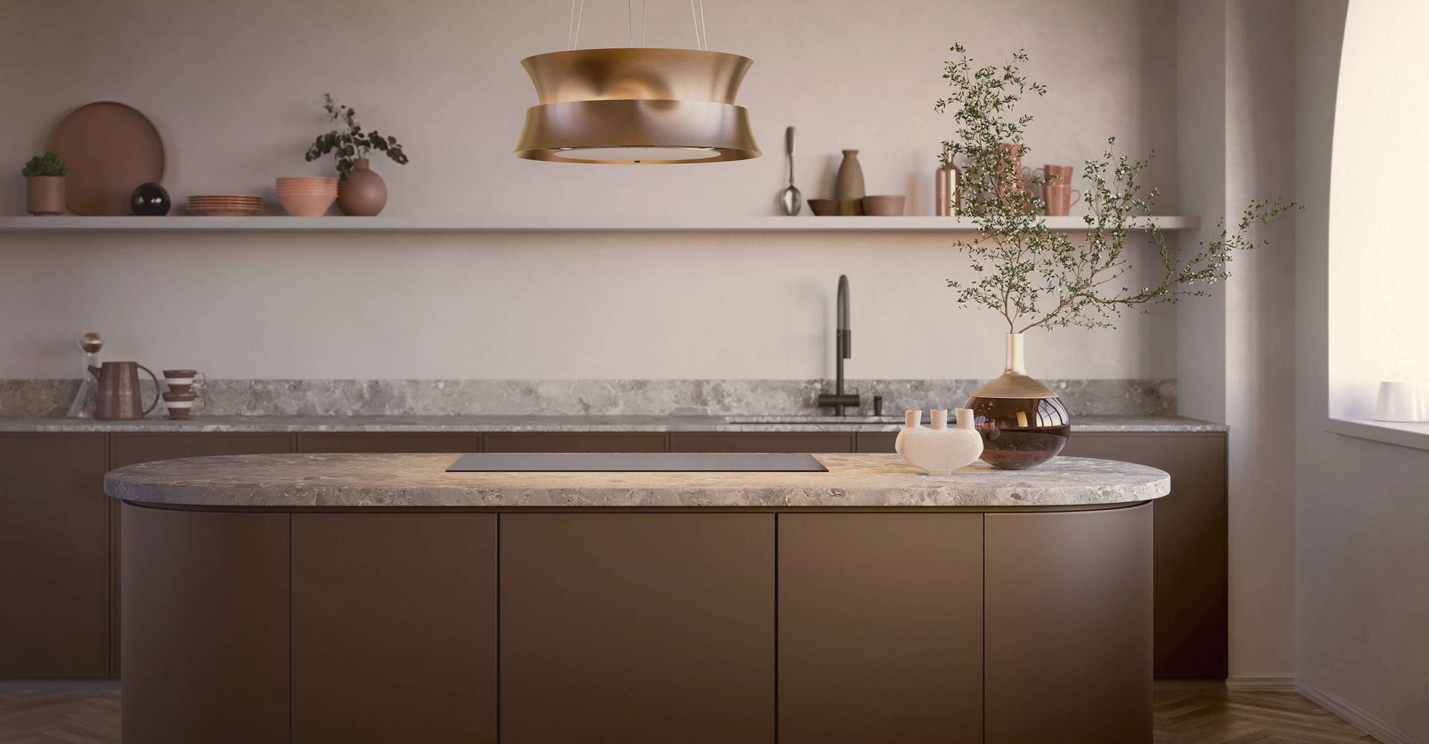
I need products that fit my chosen interior style.

I designed a high-fidelity interactive prototype to simulate a realistic shopping experience, ready for testing. During this phase, I also reworked the product categorisation to improve usability and product discovery.
I tested the prototype with five users through short interviews and usability tasks. Based on their feedback, I identified areas for improvement and iterated on the design. Below are a few selected insights from the many I analysed.
BEFORE
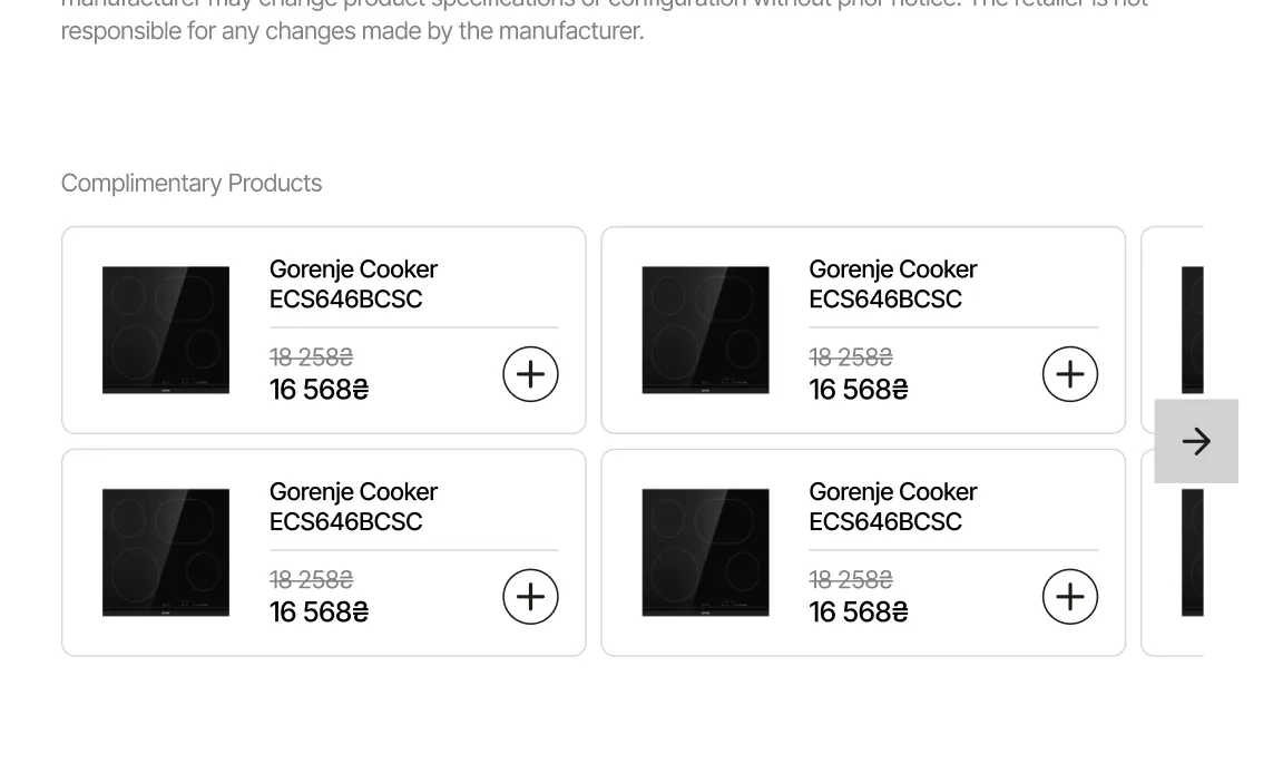
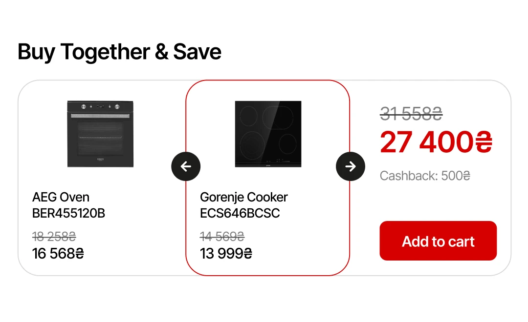
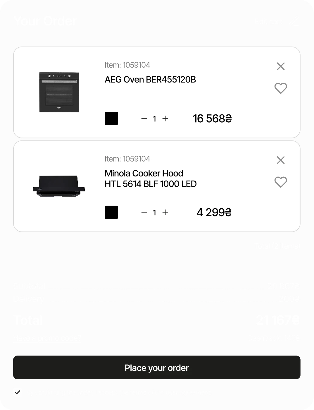
/01 PRODUCT BUNDLES
INSIGHT
Users preferred tangible discounts over complimentary products.
SOLUTION
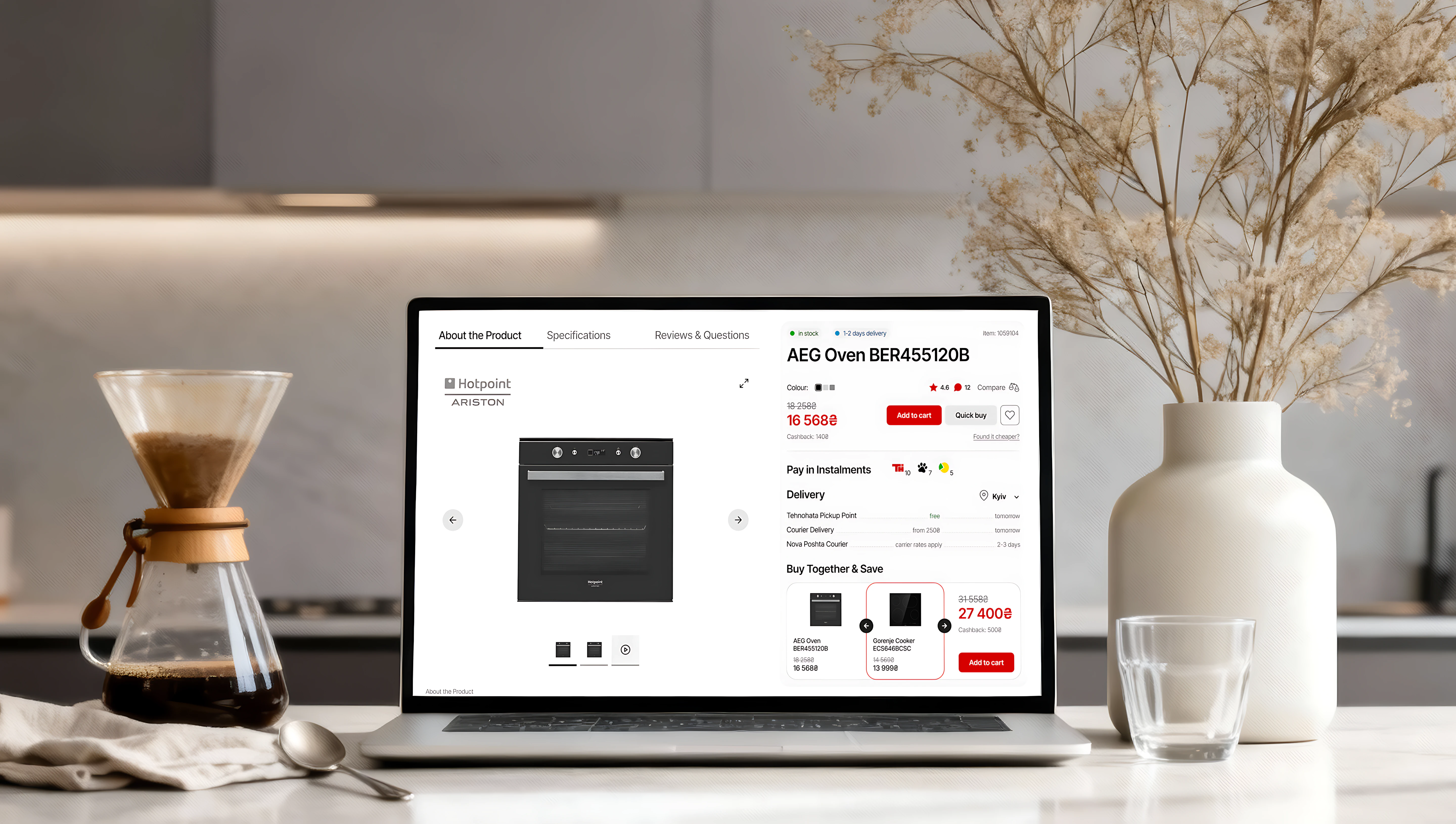
Added a "buy together & save" feature for users to purchase related items at a combined savings.
BEFORE
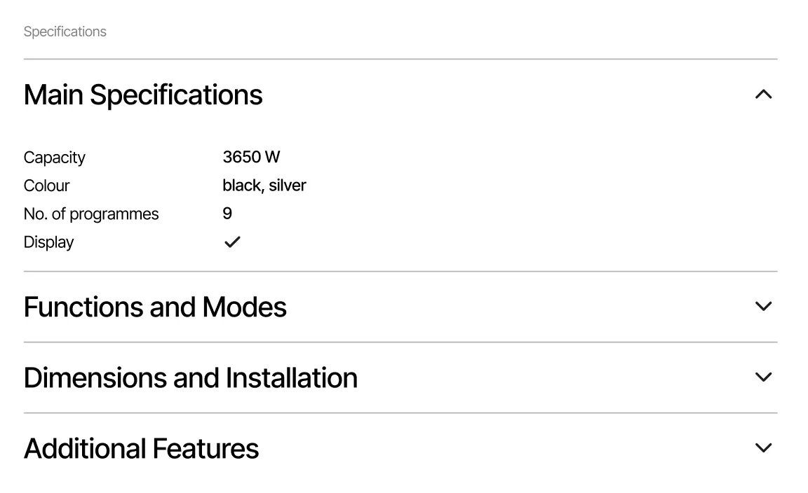
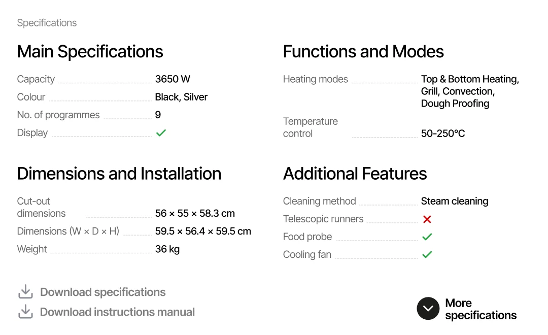
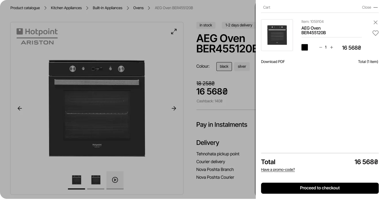
/02 PRODUCT SPECS
INSIGHT
Users found it inconvenient to open multiple accordions.
SOLUTION
Displayed key specs in a compact card with an option to expand for full details.
BEFORE
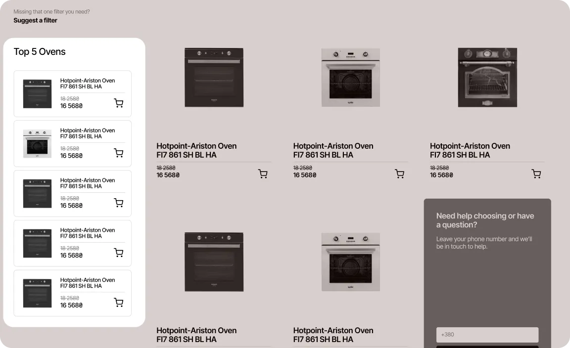
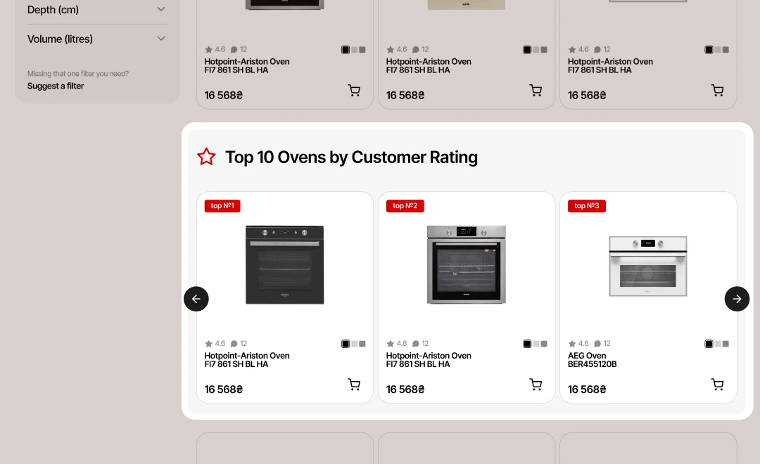
/03 TOP PRODUCTS
INSIGHT
Users struggled to find top-rated products hidden below filters.
SOLUTION
Added a larger 'Top Rated Products' section to help users find trusted items quickly.
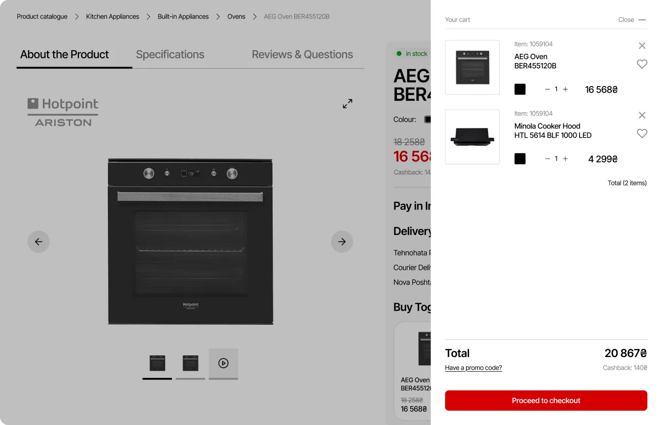
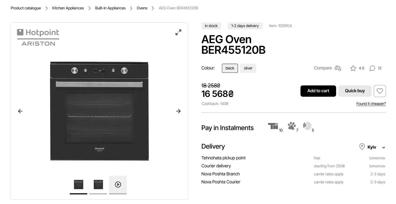
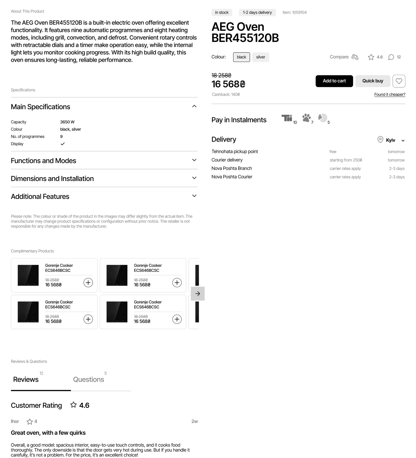
Product page has a more modern layout with key CTA fixed on the screen. It is now visually organised and easy to scan. Specs are clear and concise. “Buy together & save” feature increases revenue by offering a bundle.
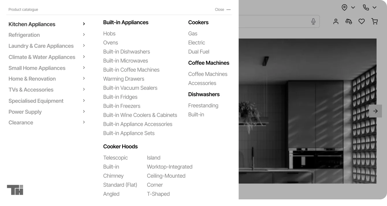
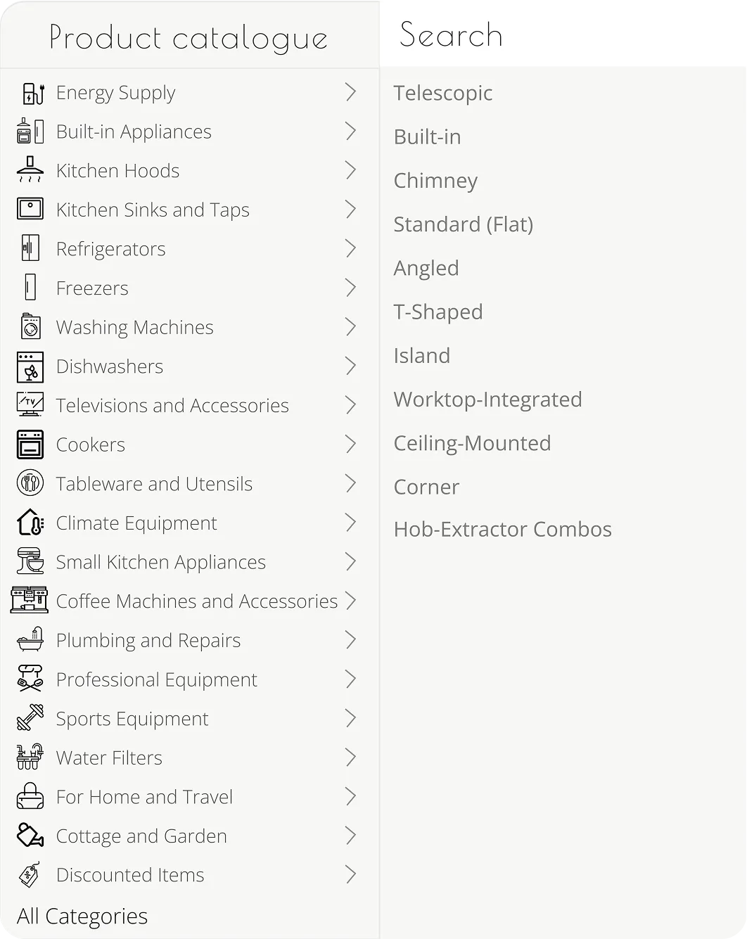
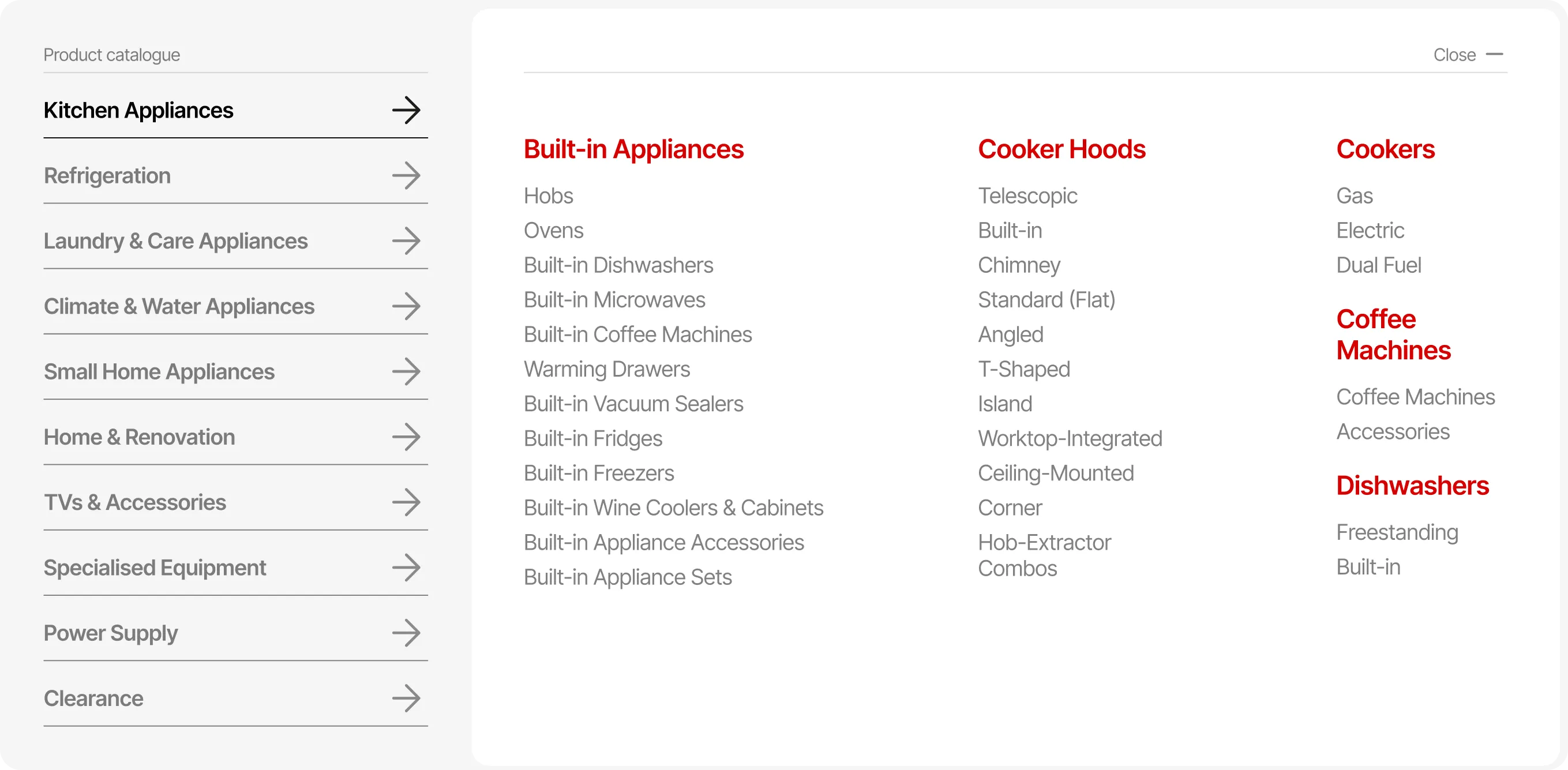
By introducing another level of hierarchy to the catalogue, I significantly reduced the main list of categories, making it easier to narrow down quickly. The horizontal catalogue uses space more efficiently and helps guide the users eye left to right.
BEFORE
AFTER
swipe


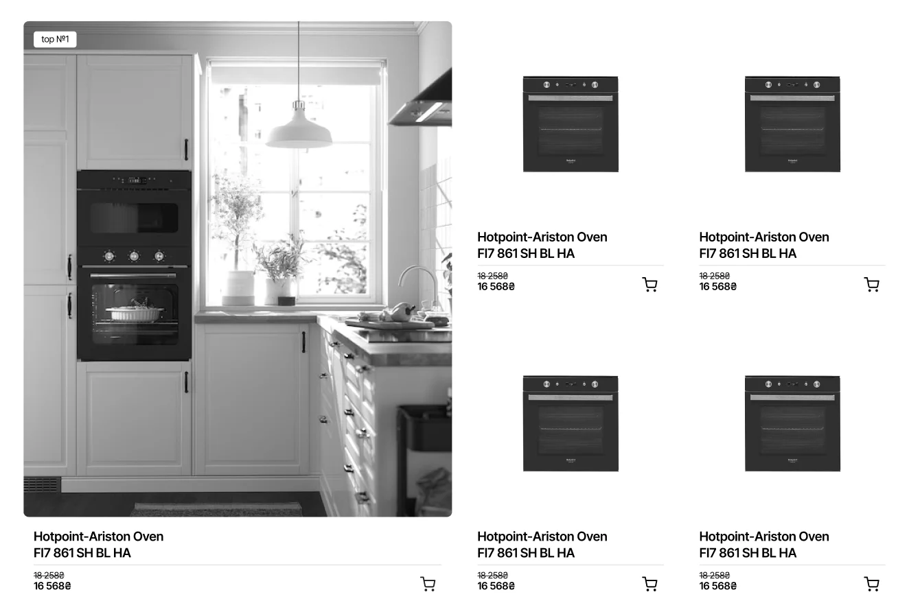
The new card is cleaner, with lots of room for product image and CTA clearly visible. Colour options, product rating and key specs shown on hover help user compare products at a glance.
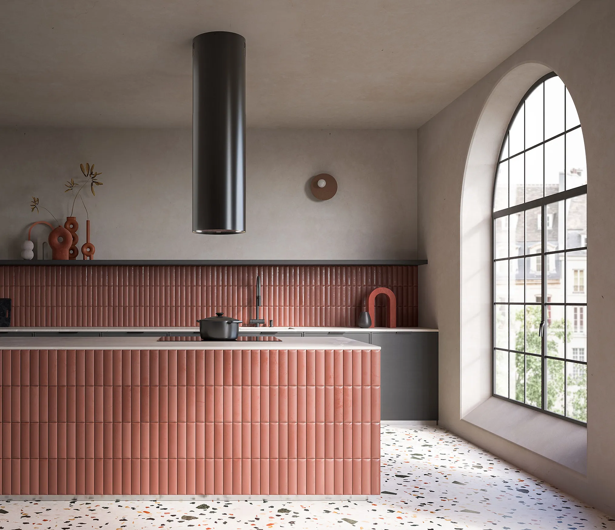


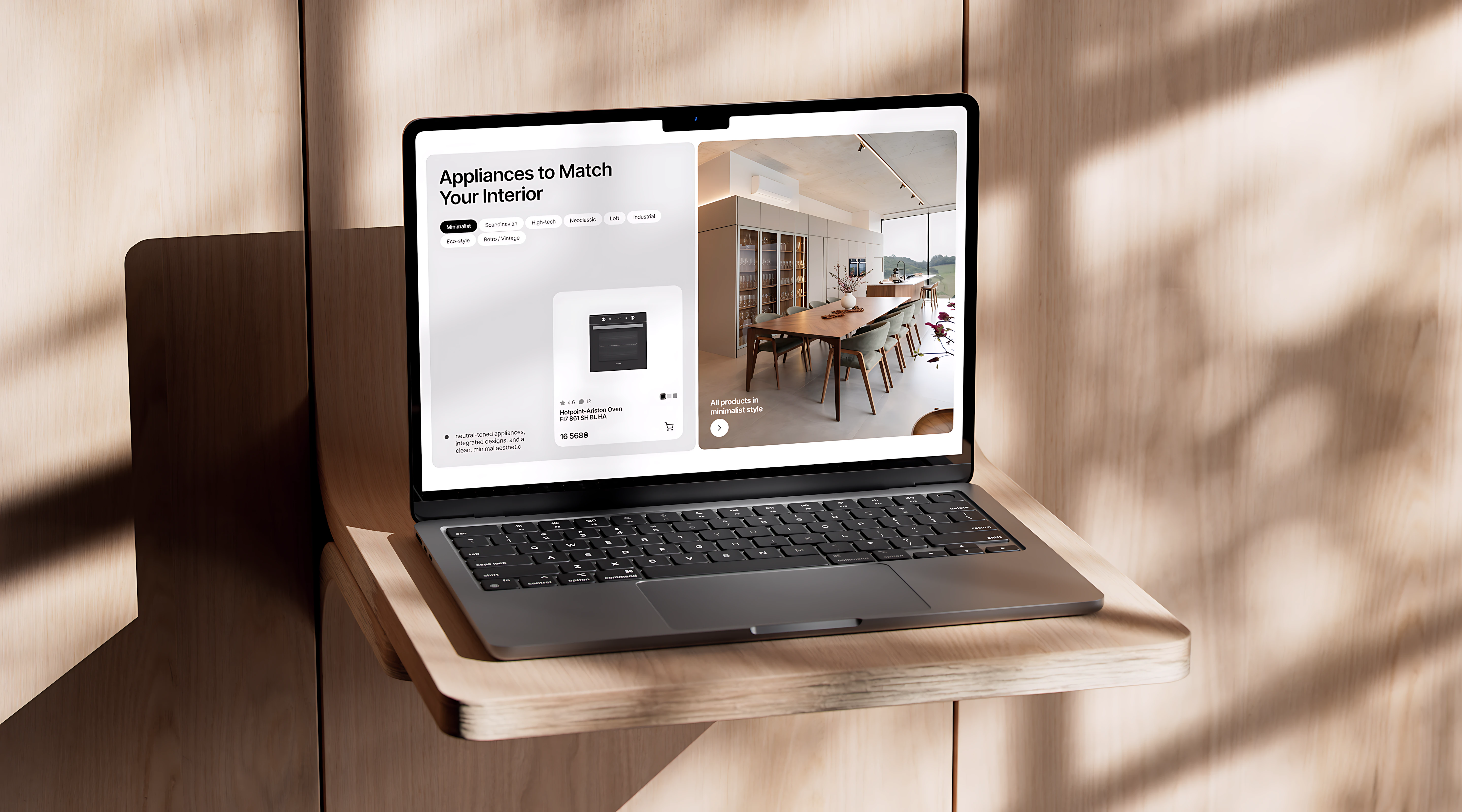
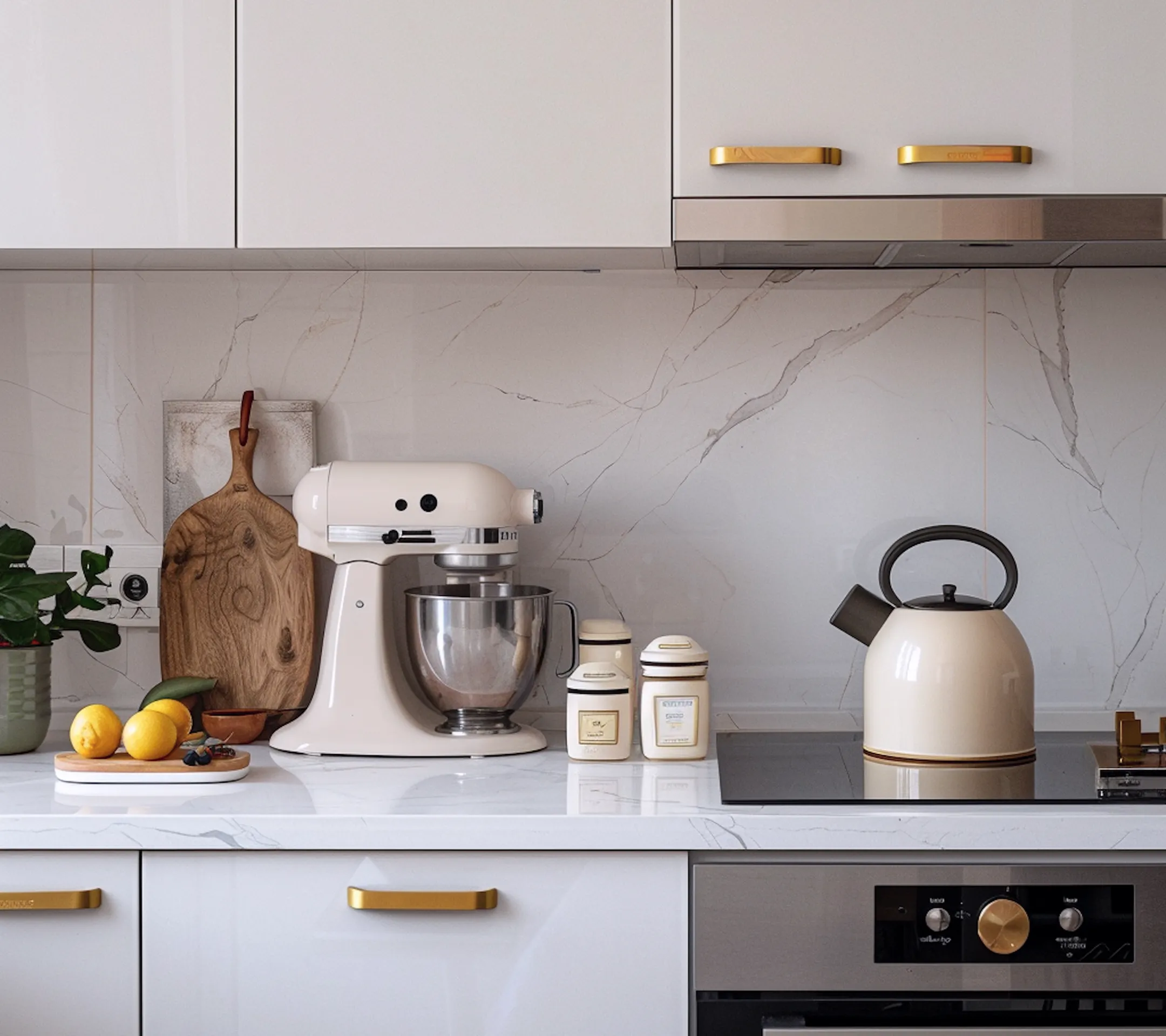
All products in Minimalist style
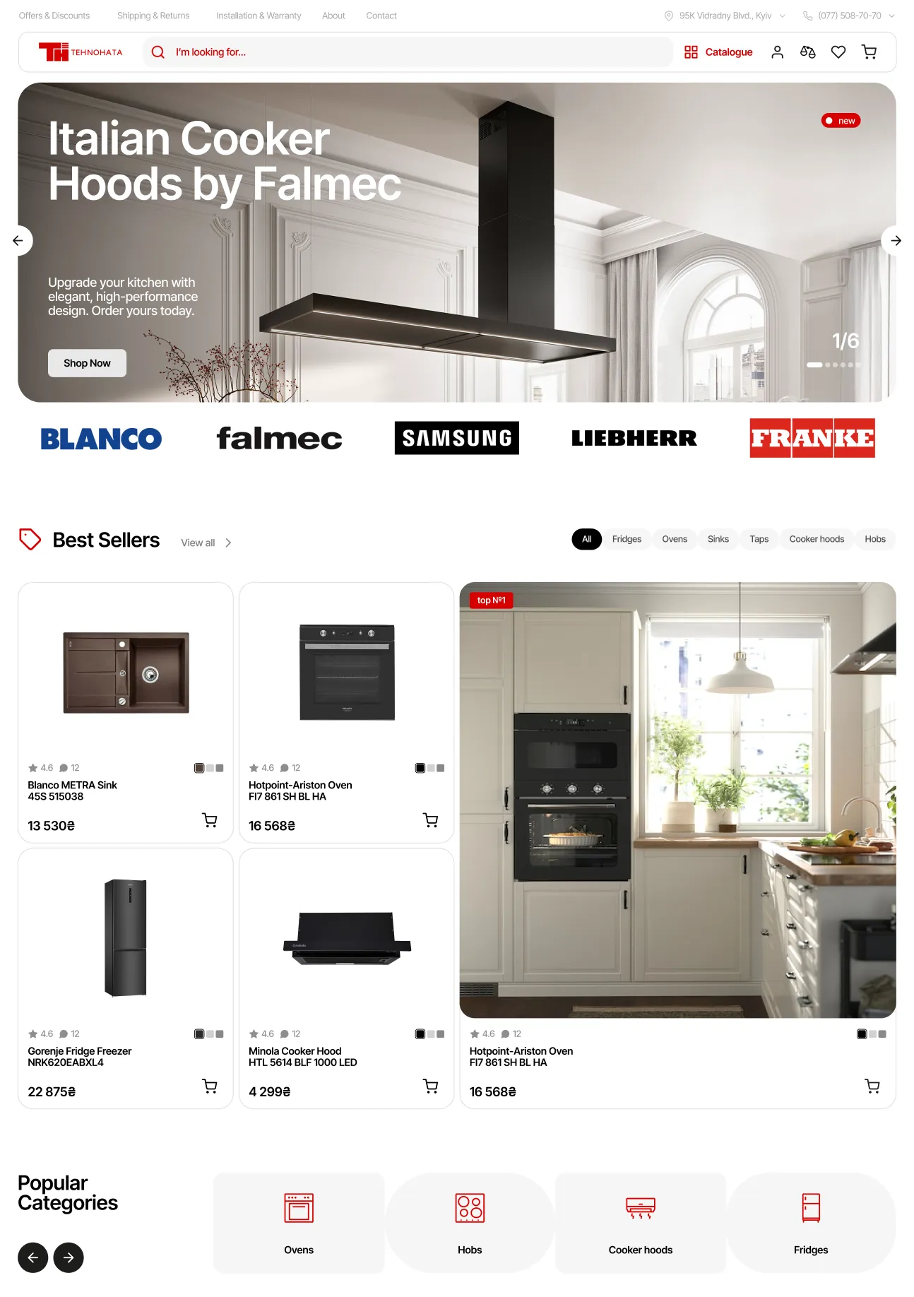
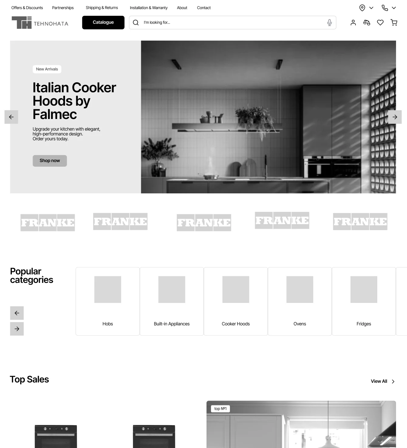
Homepage is designed to attract the user with a variety of themed product groupings to boost conversion. Store's advantages, deals, and flexible payment options are also presented here to increase trust and store's credibility.
Results & key learnings
The new experience made product discovery smoother, more intuitive, and more confidence-inspiring for users.
By reducing visual clutter and improving navigation patterns, the redesign helped simplify complex purchase decisions while creating a warmer, more polished brand presence.

KEEP EXPLORING

Landing page for a stylist to strengthen their personal brand and draw in clients.
VIEW CASE